
While there are certainly more than five elements that can be used to create a killer website, we surveyed some of our recent projects and found some consistent themes. Here are five killer elements used to create a great website:
1. Imagery to Evoke Emotion
Every decision we make involves emotion. The images you use on your website will set the tone far quicker than the visitor can even read the first sentence, so use them strategically. Think about what emotion you’re trying to evoke and use imagery that captures that feeling. Invest in a professional to get quality shots. If you’re on a tight budget, you can choose from an endless supply of online stock images. There are many great stock image sites where you can purchase images one at time (or save money with a package or subscription) or, as a last resort, utilize a free stock image site like Unsplash or Pixababy.
2. Social Proof
It’s easy for a company to brag about themselves on their website, but why not let your customers or clients do the bragging for you? Social proof, or third-party validation, is the fastest way to gain the trust of a potential customer or client*. While traditional written reviews are good, take it to the next level by capturing the endorsement in a video. Video testimonials provide the opportunity for a more personal connection and build a deeper level of trust than just a written review.
*If your company has reviews available on unaffiliated websites, like Google, Angie’s List, or Facebook, provide links to those pages.
3. Funnel to a CTA
Your home page should be a preview of everything that is on your site, funneling the visitor down to a call to action. The content on the home page doesn’t need to answer every question, but should answer the basics and provide enough information that the visitor will want to subscribe to your e-newsletter, submit a contact form, follow you on social, or pick up the phone.
There are two main reasons to make sure this funnel is on your home page – and they both have to do with the fact that more and more users are surfing the web on their phones.*
1. It’s just easier to continue scrolling/swiping down the page than clicking to another page.
2. Chances are if the visitor is on their phone, it’s likely they’re on the go and using cellular data; therefore, the page load speed is likely slower than on their computer. You don’t want them to have to wait on multiple pages to load before they get to your CTA.
*Statista.com reports that in Q1 2019, mobile devices (excluding tablets) accounted for 48.71% of global web traffic.
4. Unique Value Proposition
Why are you in business and what do you do better than the competition? Answer these questions boldly on your homepage before the user has time to ‘X’ out or hit the back button. Is your company the best, the fastest, the most efficient, the only service in town? Don’t be shy. We live in a world with unlimited options online and you don’t want to make the user work to find out why they should engage your company.
5. Be Bold, but On Brand
Your website is your chance to leave a lasting impression. Make sure they don’t leave your site without knowing some basic things about your company. This short checklist may seem obvious, but it’s amazing how many websites we see that miss on these items:
1. Make sure they recognize your logo. Display it clearly and prominently at the top of the page*, but don’t overuse it, once per page is the standard.
*Statistics consistently show that the top left corner is best for user brand recall.
2. Establish the personality of your company. Is your company fun and energetic, serious but compassionate, or trendy and on the cutting edge of technology? Use the tone of your images and copy to establish these traits.
3. Be consistent with your fonts from page to page, header to header, body text to body text, etc. For your headers, use the font used in your logo or at least from within the typography family used in the logo. There’s no need to get carried away with more than three or four different fonts on the site. Remember you can always use variants of the fonts for sub-headers or points of emphasize (bold, italic, underline).
4. Be consistent with your colors. From backgrounds and buttons, to emphasized text, use the company colors as much as possible*. Think about your imagery and whether or not it aligns with your brand colors. If an image is off brand, think about placing an overlay on the picture to align with your brand colors.
*One exception to using an off-brand color might be when you’re trying to trigger an emotion or action. Do a bit of research on color psychology and you’ll be amazed at how much messaging we’re subliminally receiving online.

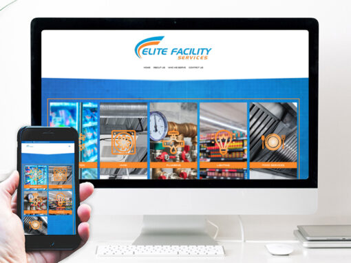
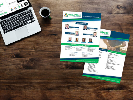
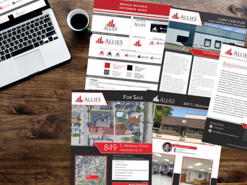
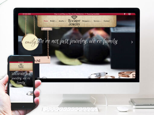
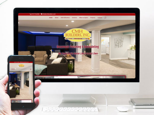
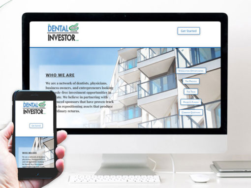
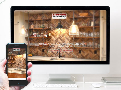
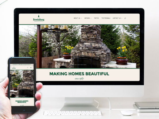
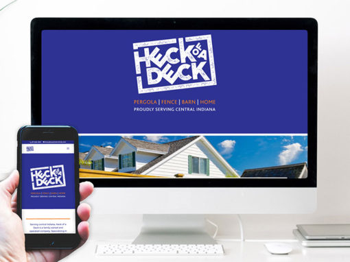
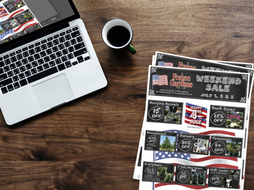
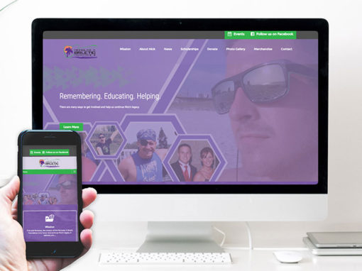
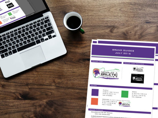
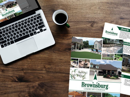
EXAMPLES OF OUR WORK


We’d love the opportunity to share a conversation with you about your goals online. Fill in the form below and we’ll be in touch!